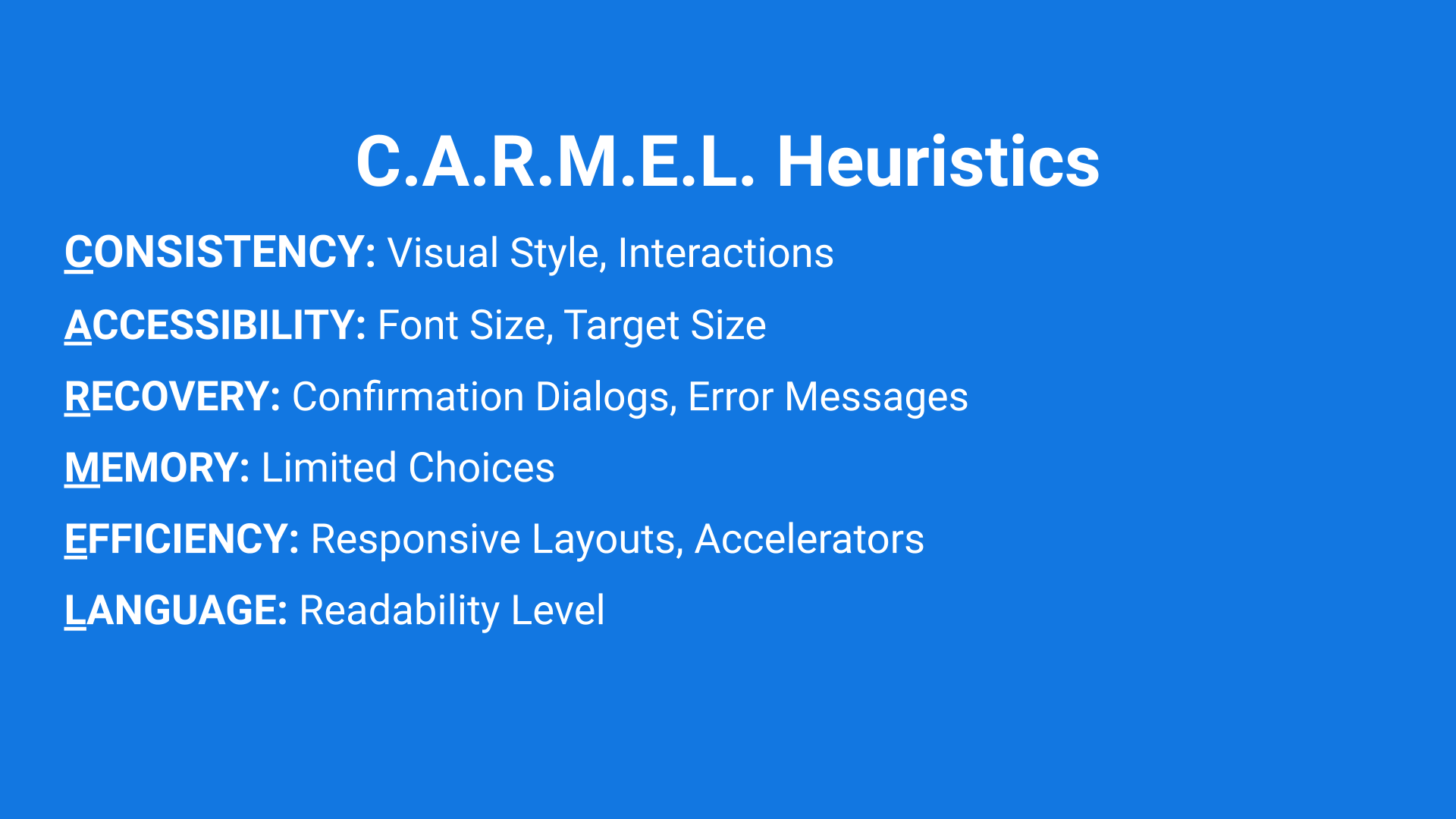
Kaniasty’s CARMEL Guidelines
The CARMEL guidelines are inspired by Nielsen’s usability heuristics, but incorporate knowledge and standards that have emerged since Nielsen’s principles were published over 20 years ago, including best practices for accessibility.
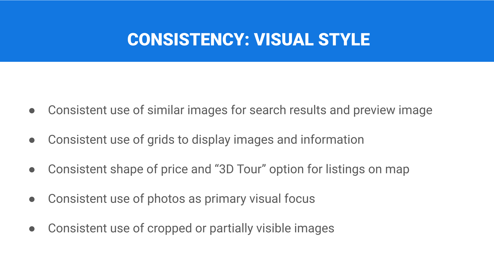
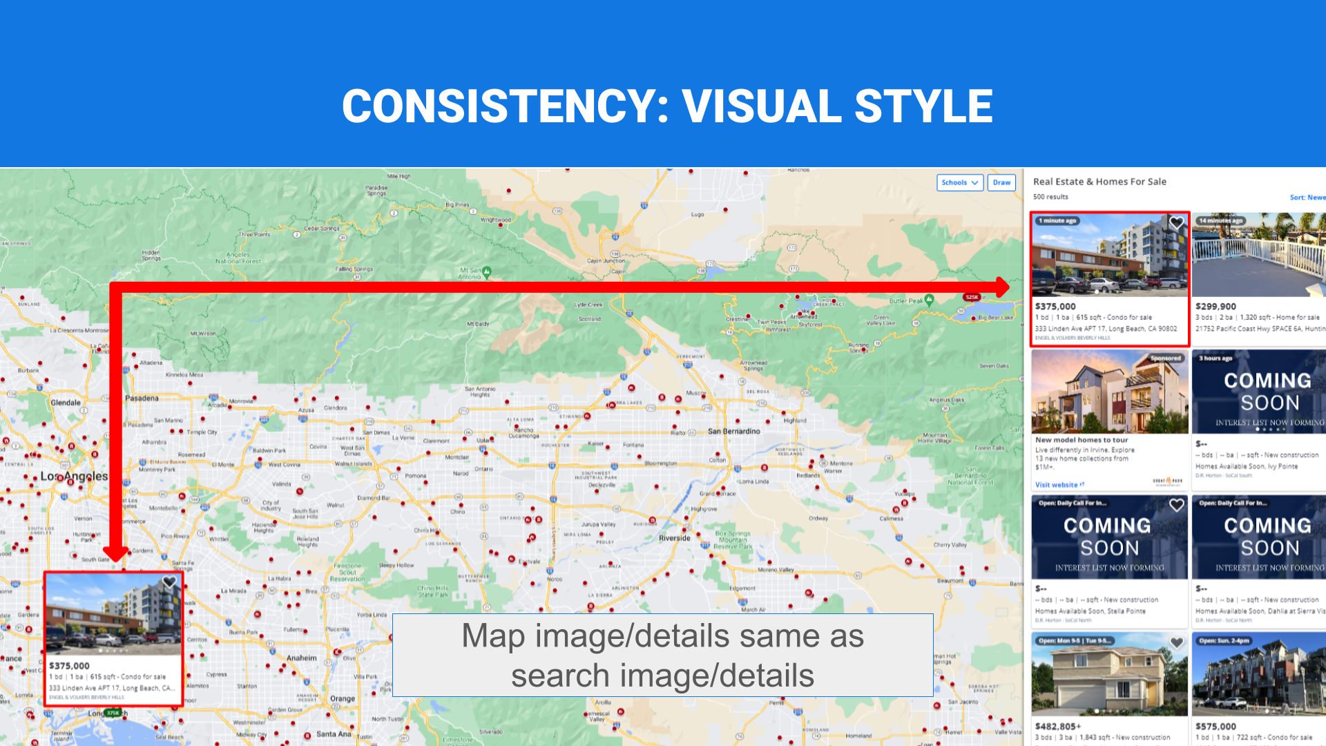
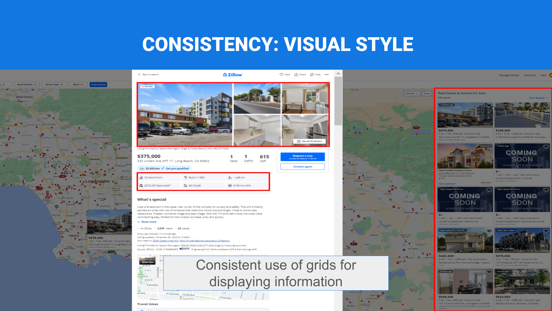
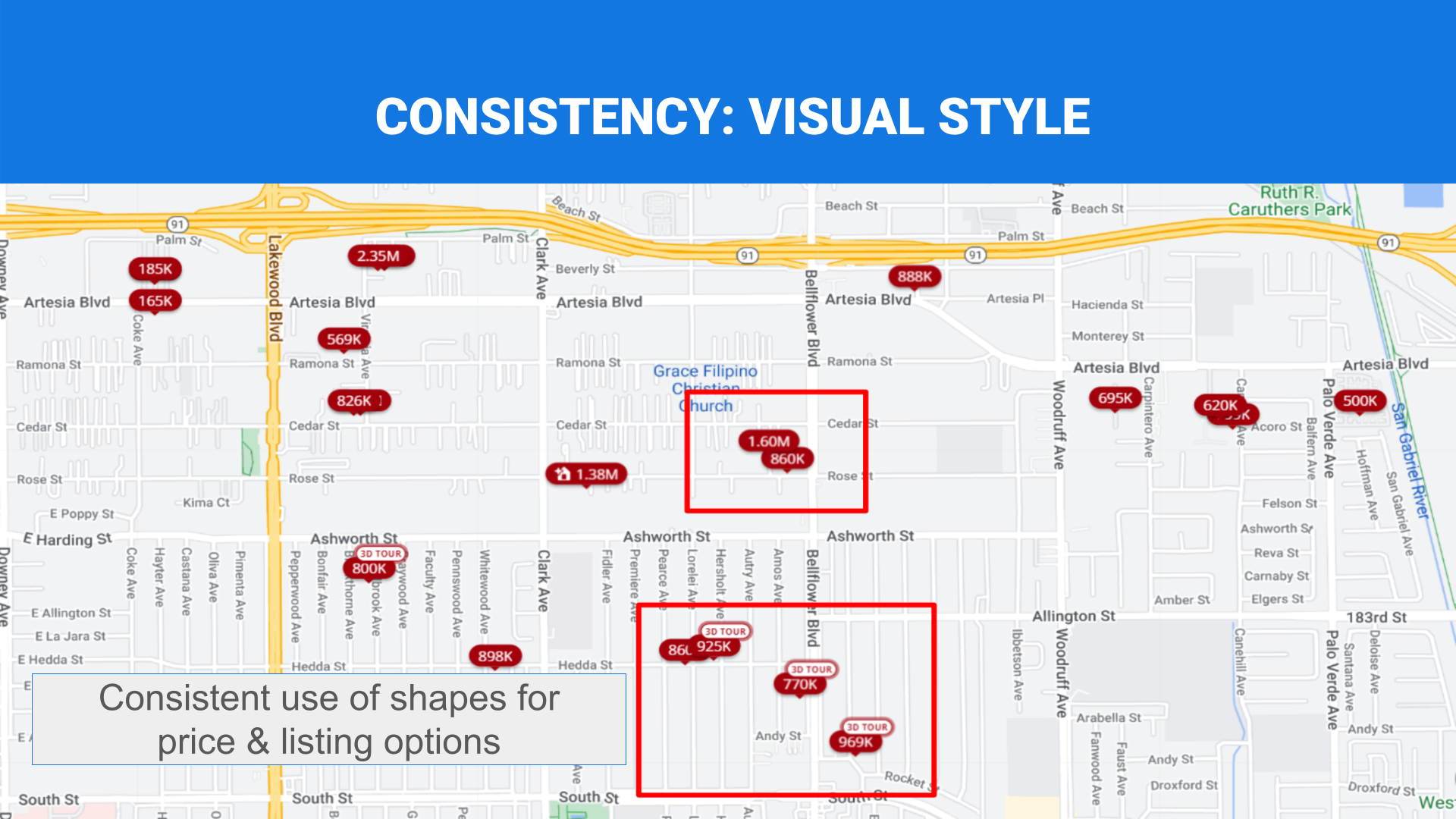
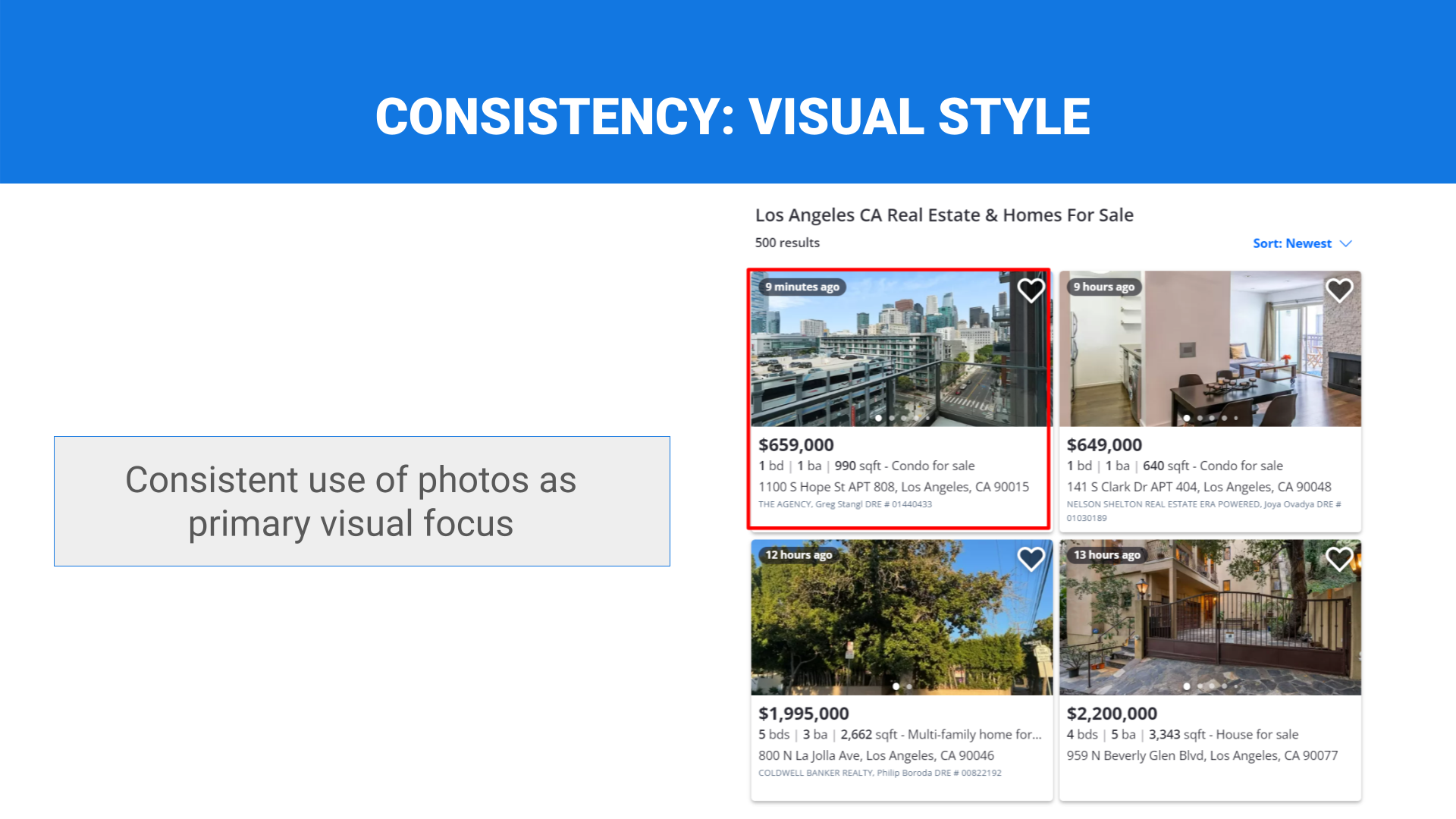
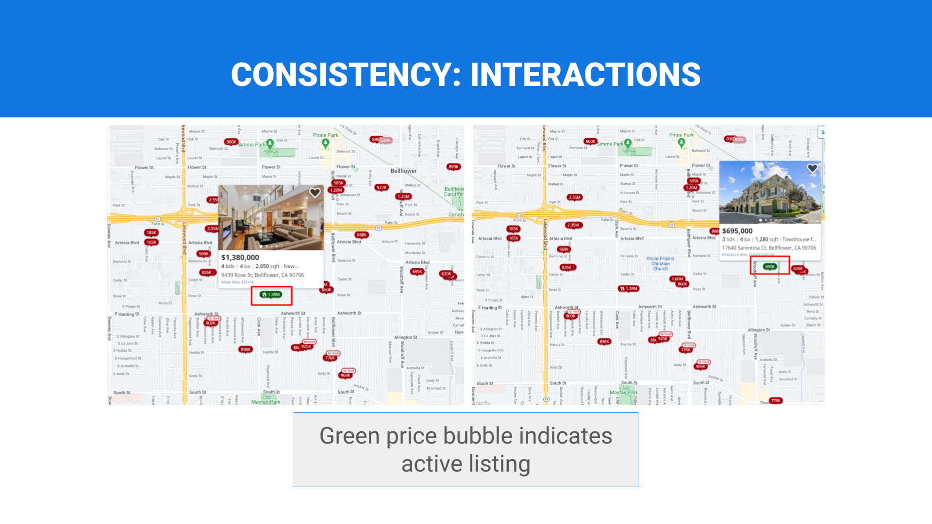
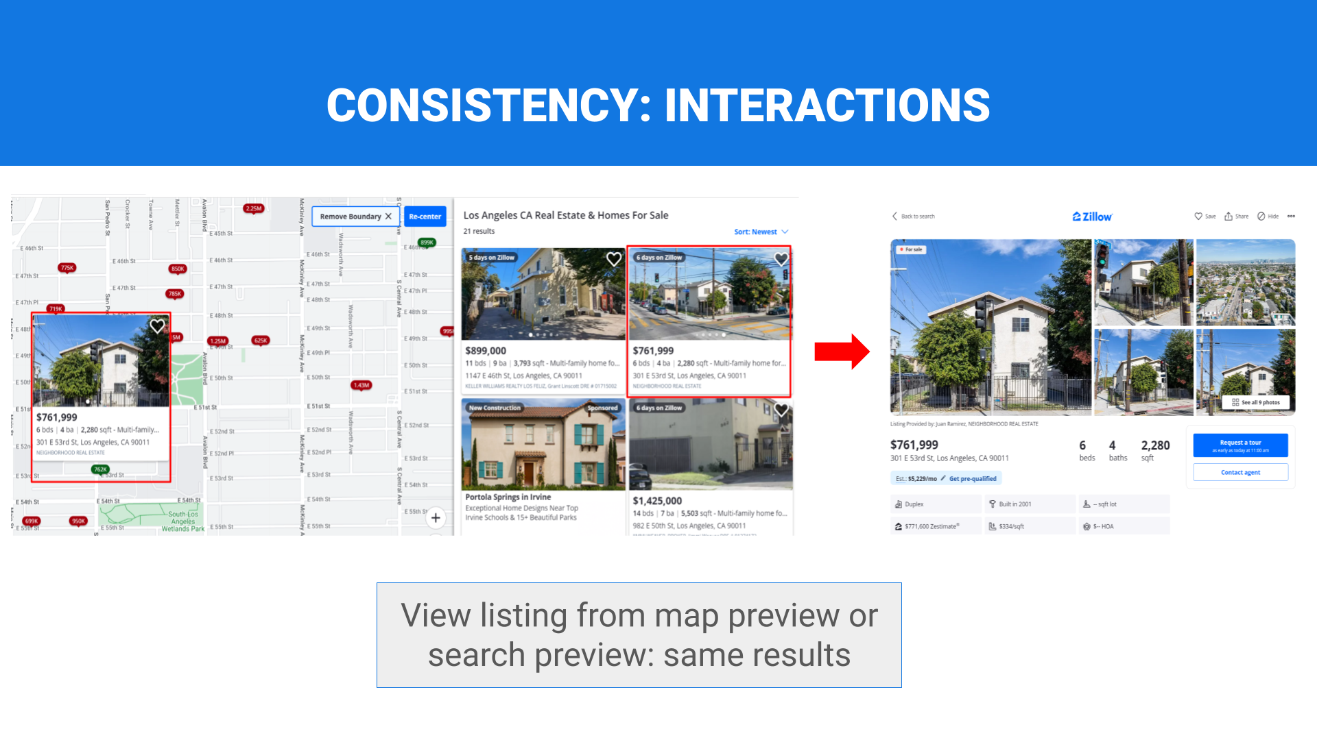
Consistent visual style
The design follows branding or style guides that dictate the use of logos, color, and typography.
Look & feel
Layouts and page elements utilize an attractive visual design.
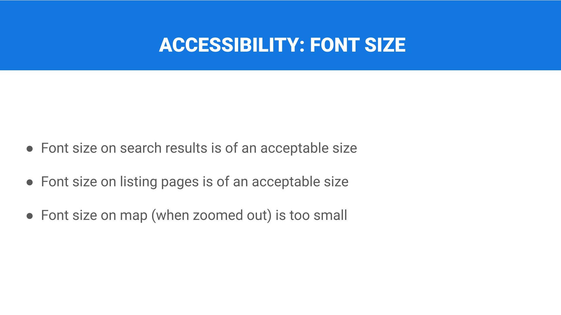
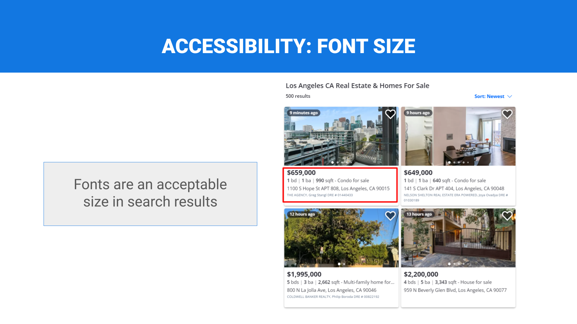
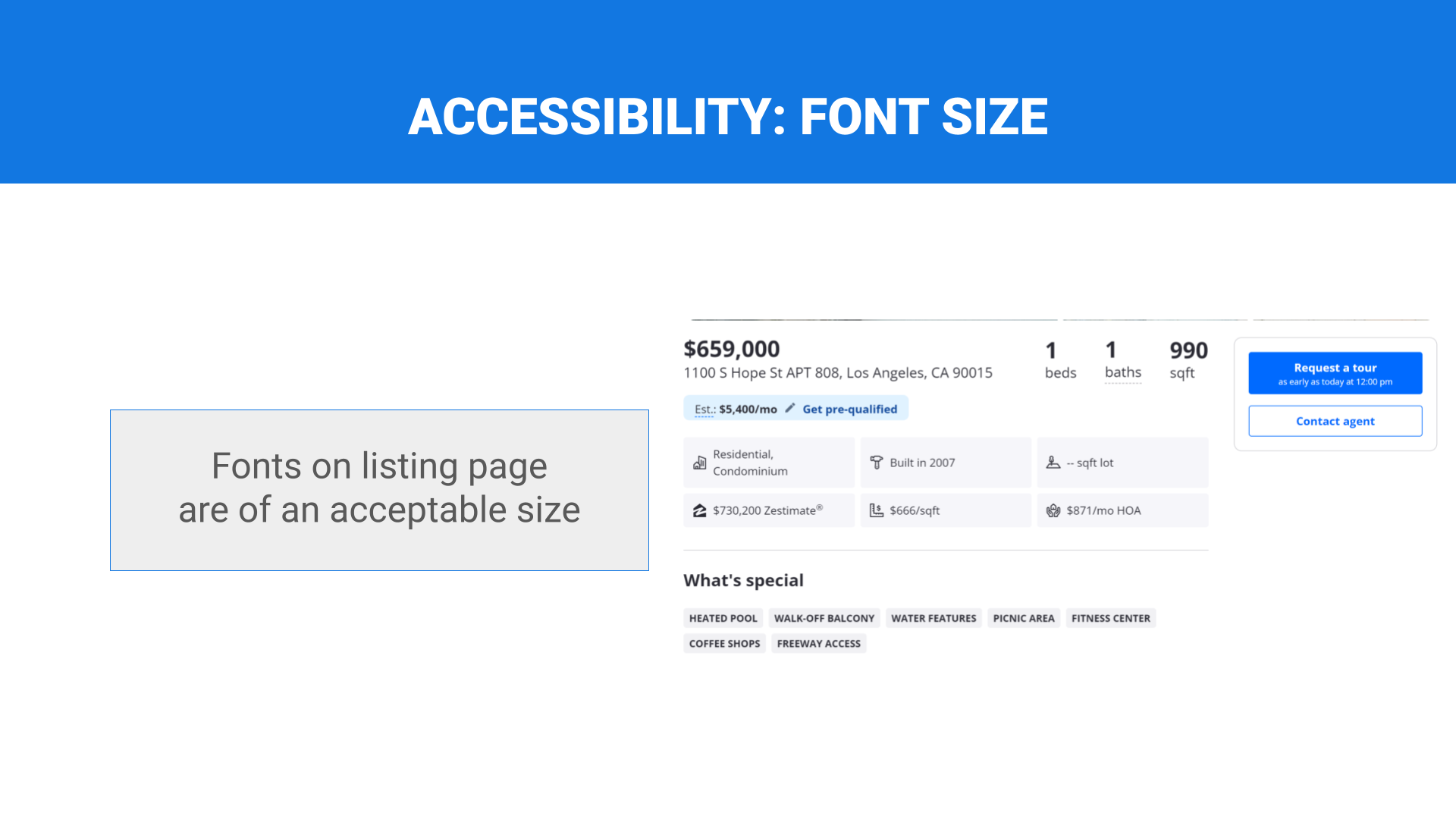
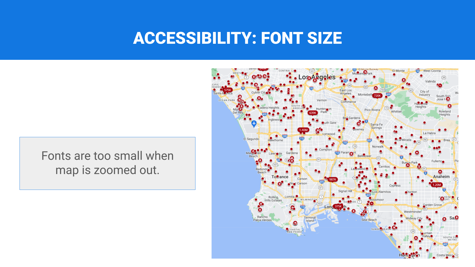
Font size
The design meets minimum font size legibility guidelines.
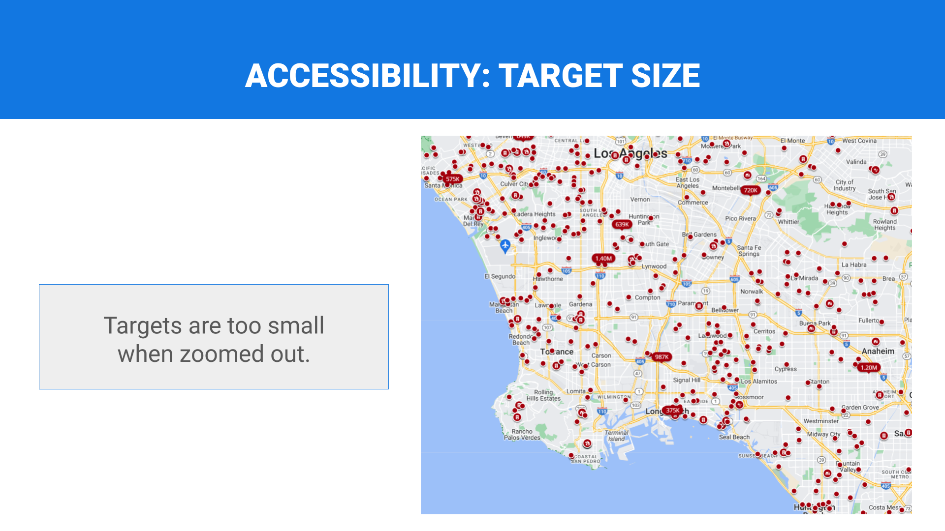
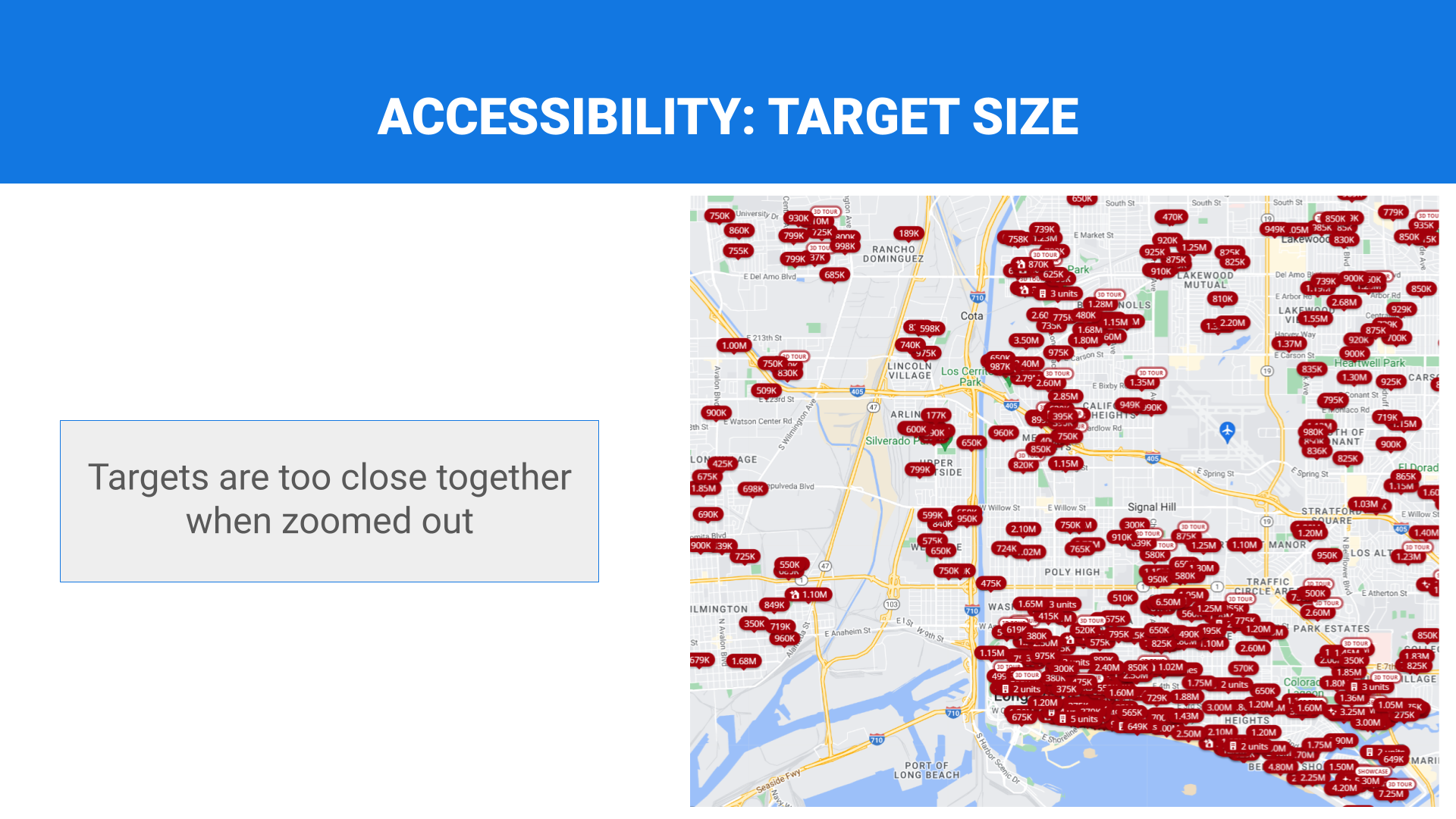
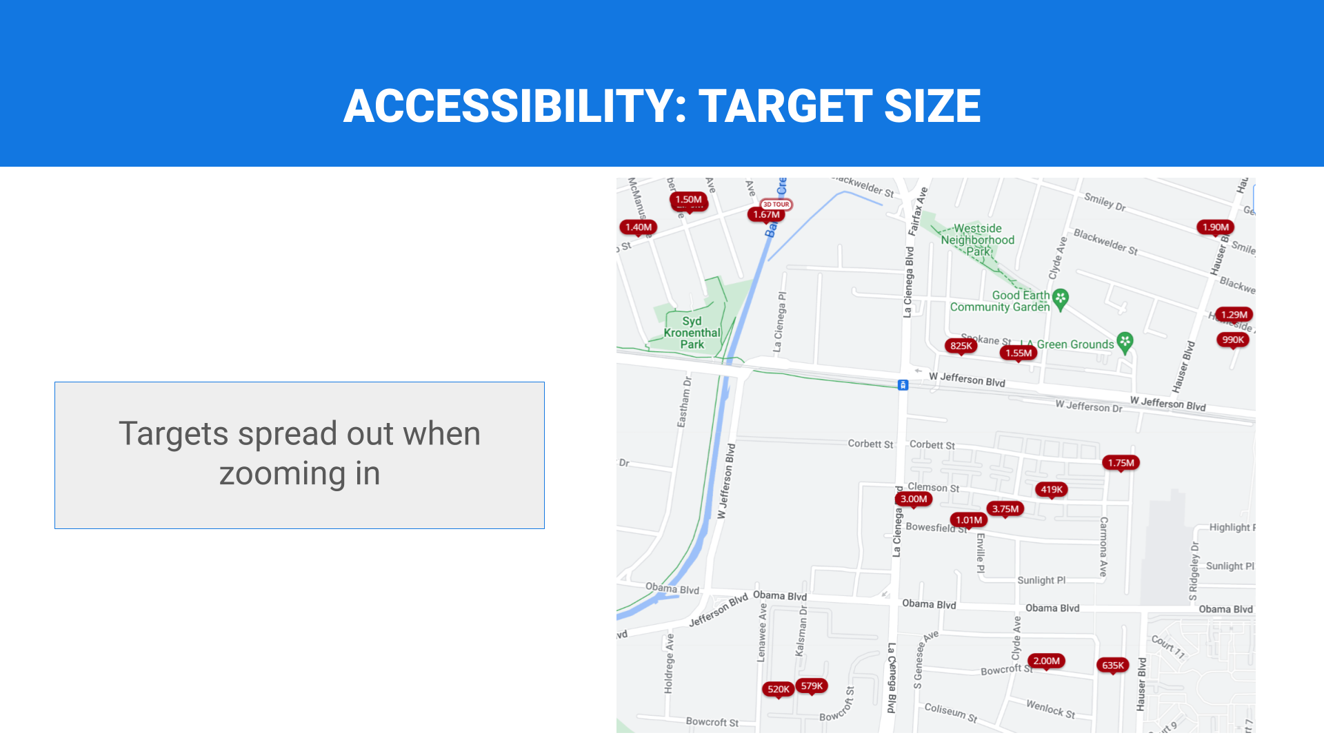
Target size
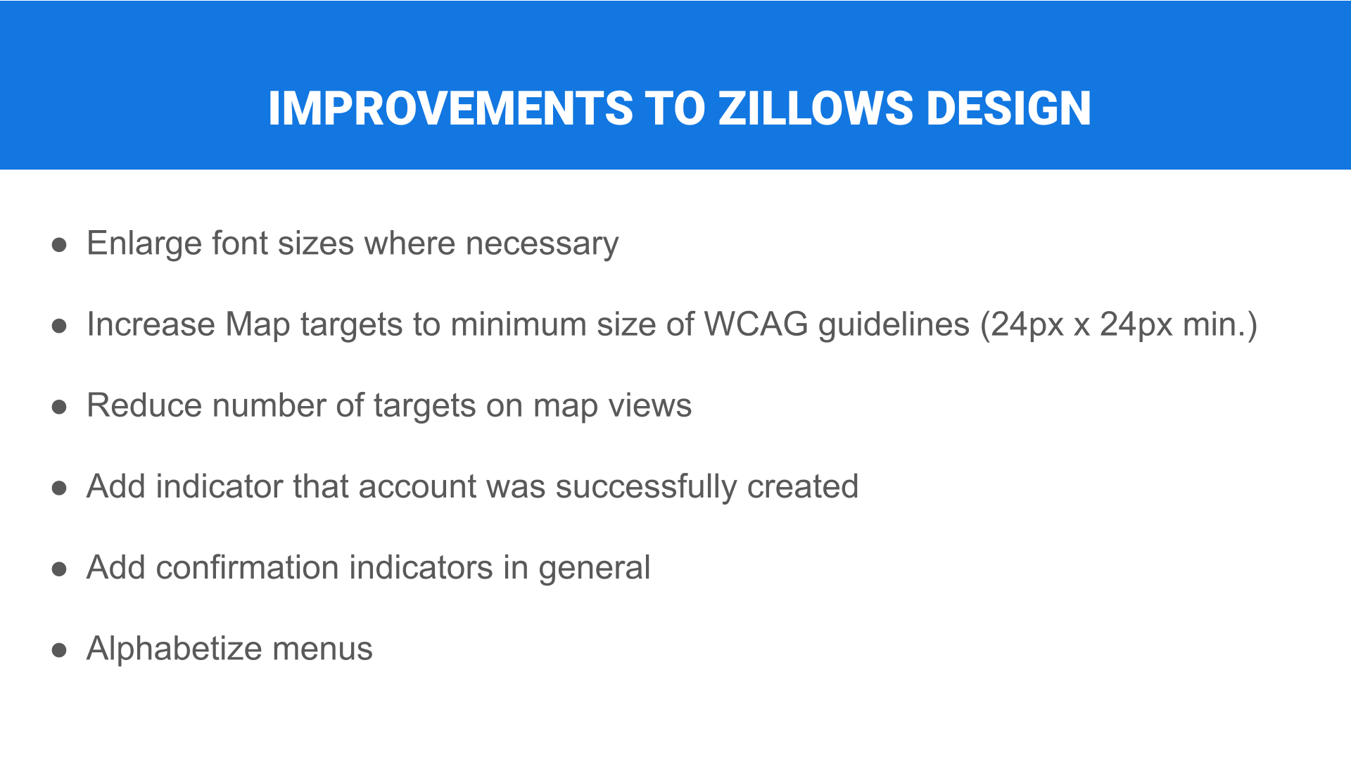
The design meets guidelines for minimum target size for mouse and touch targets
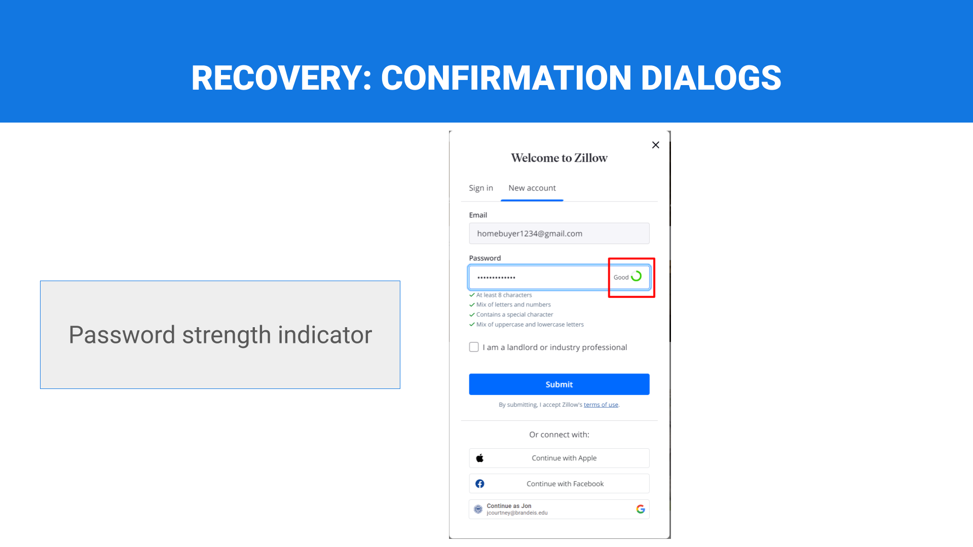
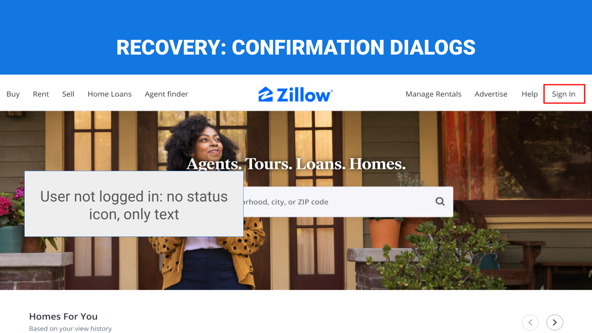
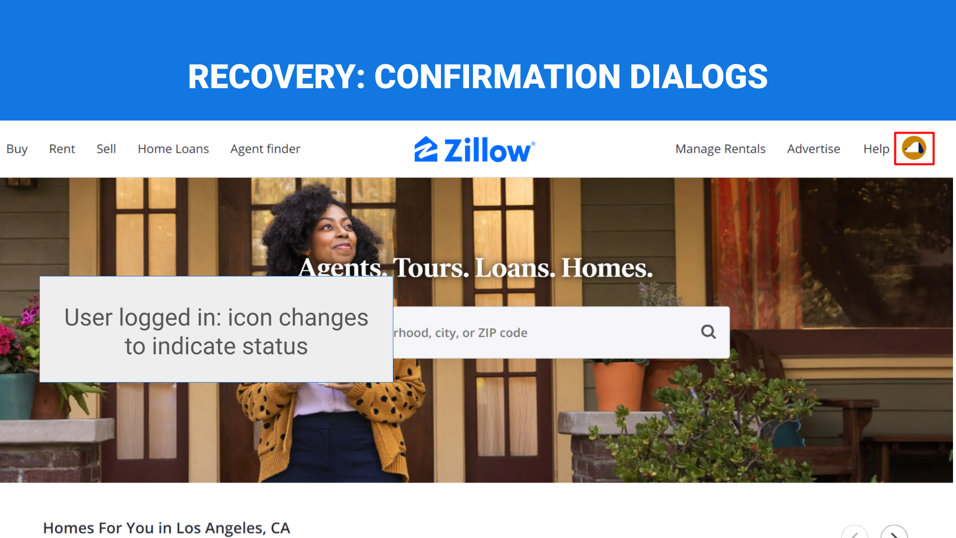
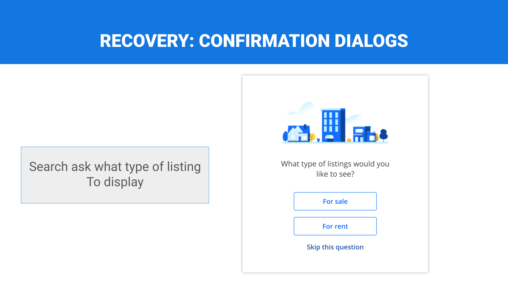
Confirmation dialogs
Destructive or high-impact actions require confirmation.
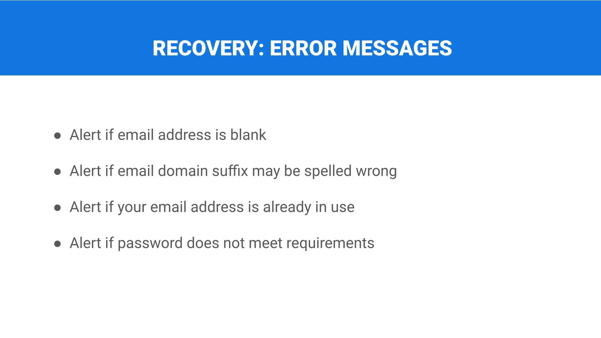
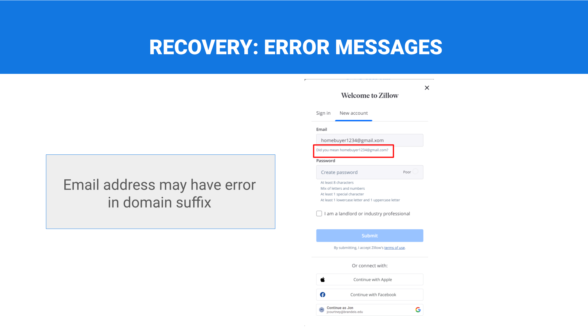
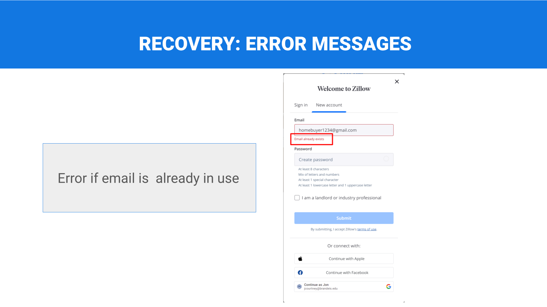
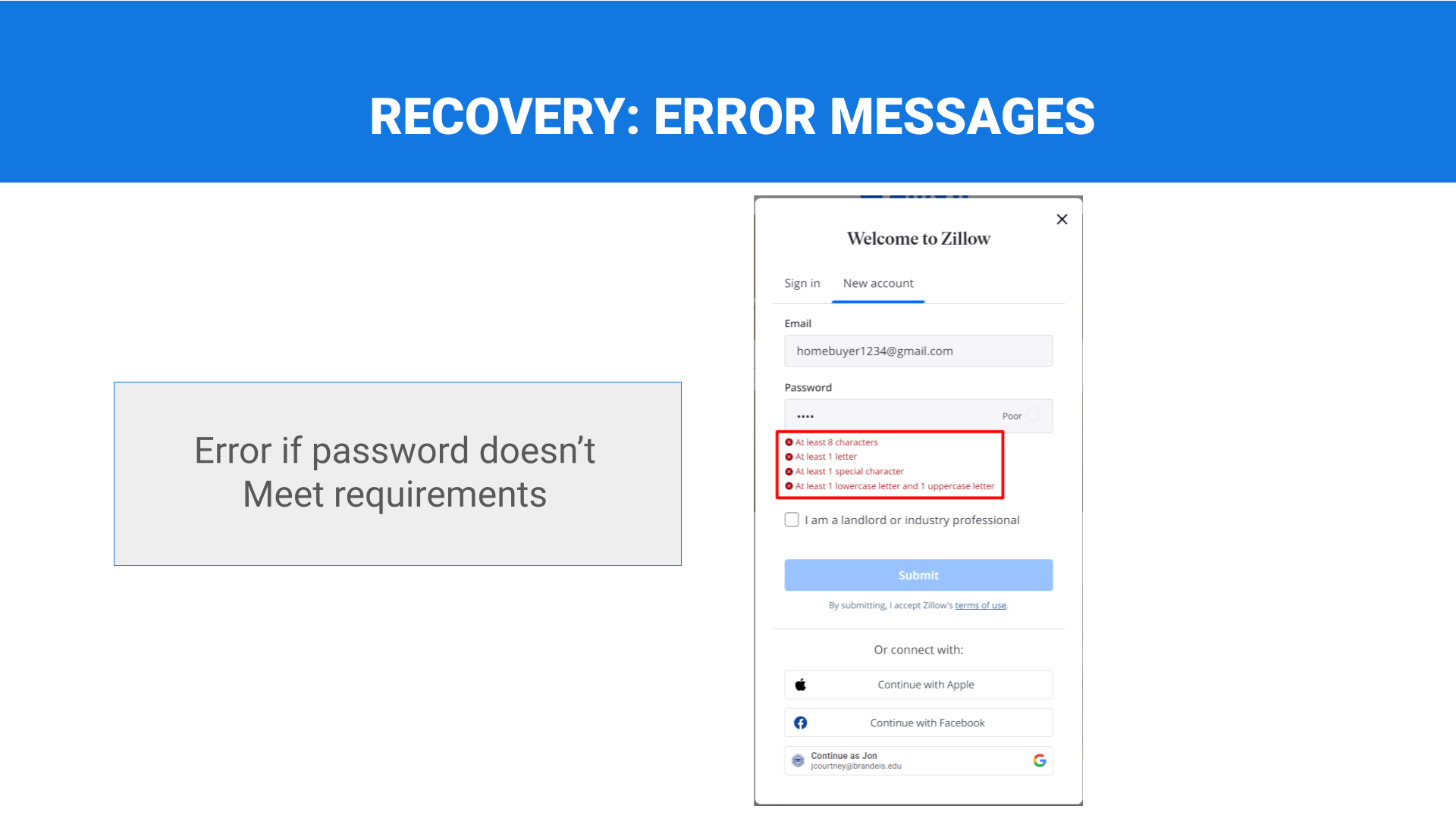
Error messages
Error messages include instructions for recovery.
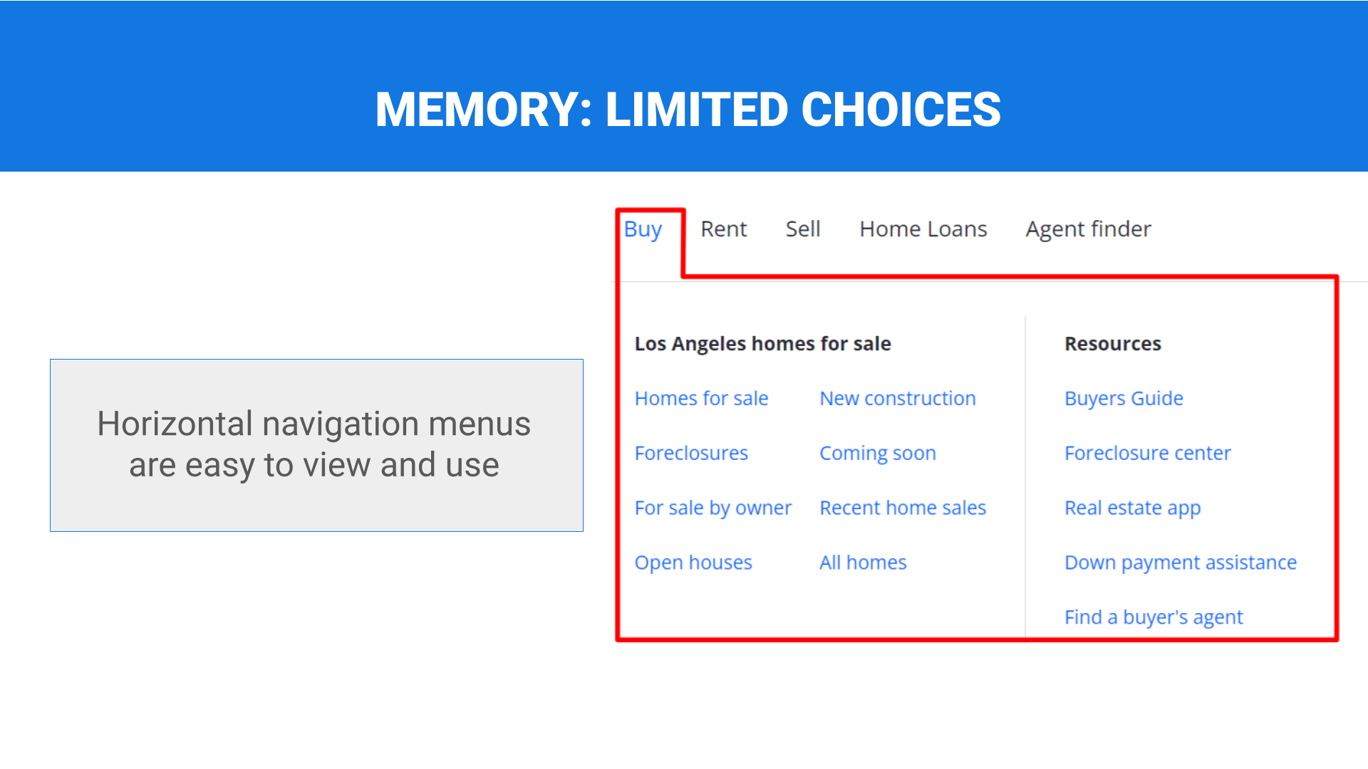
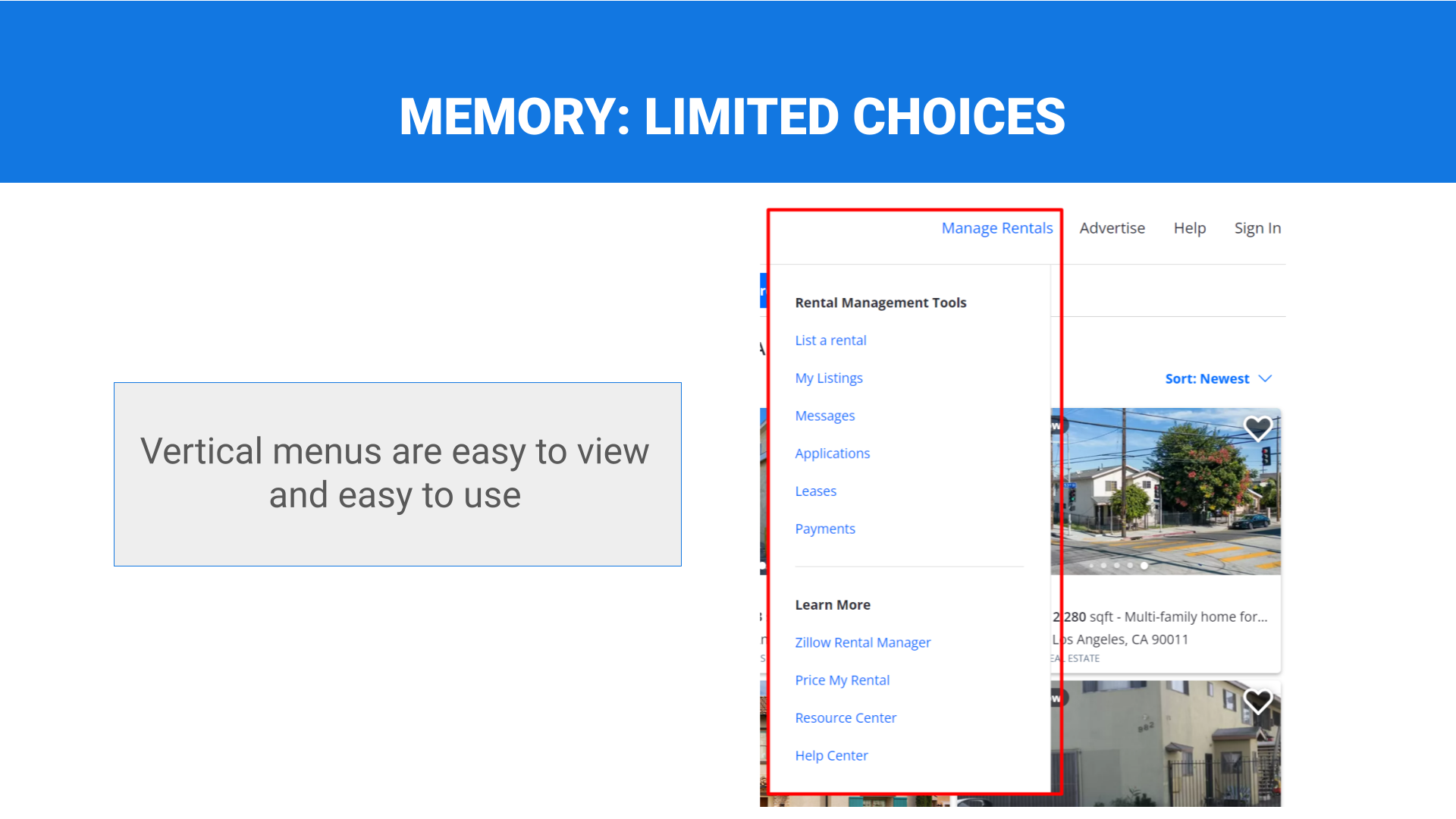
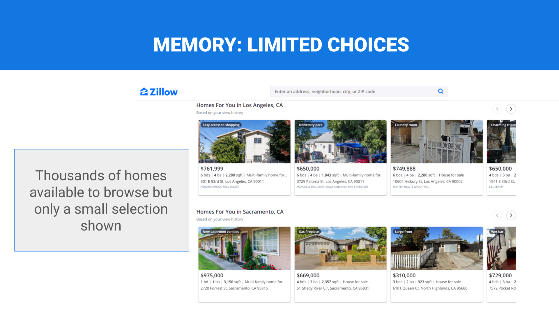
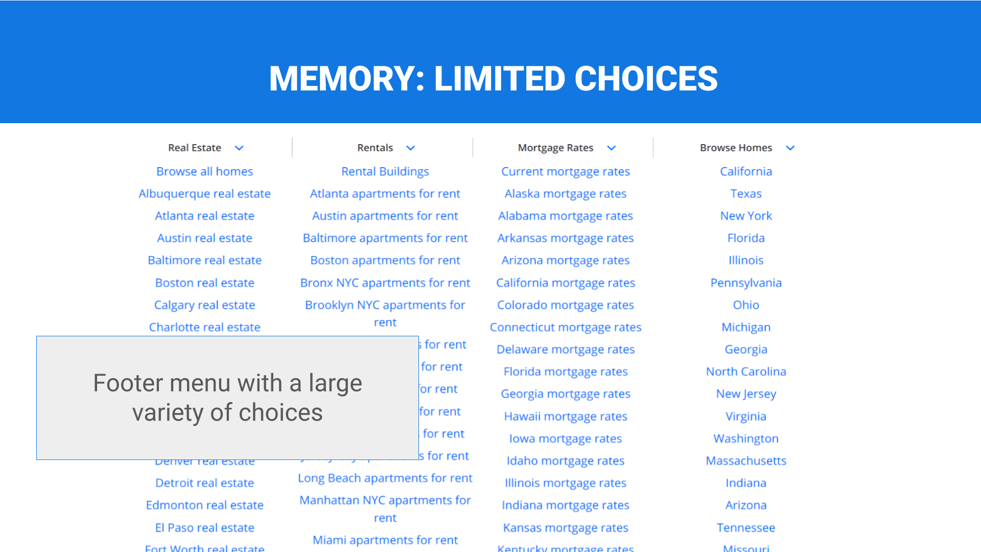
Limited choices
Lists of critical choices (menu options, navigation categories) are logically sorted, visible in a single view, and/or limited to <10 items.
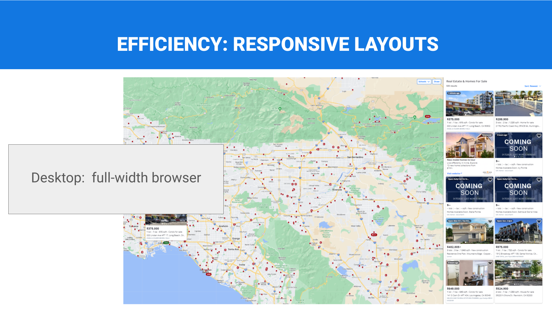
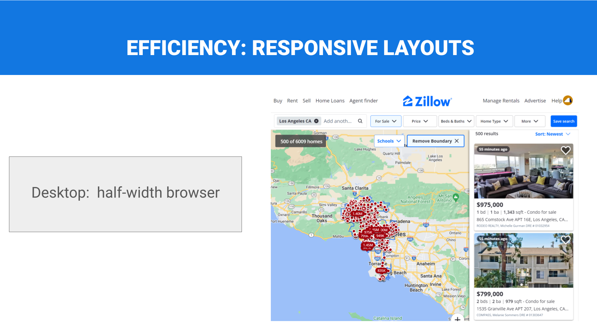
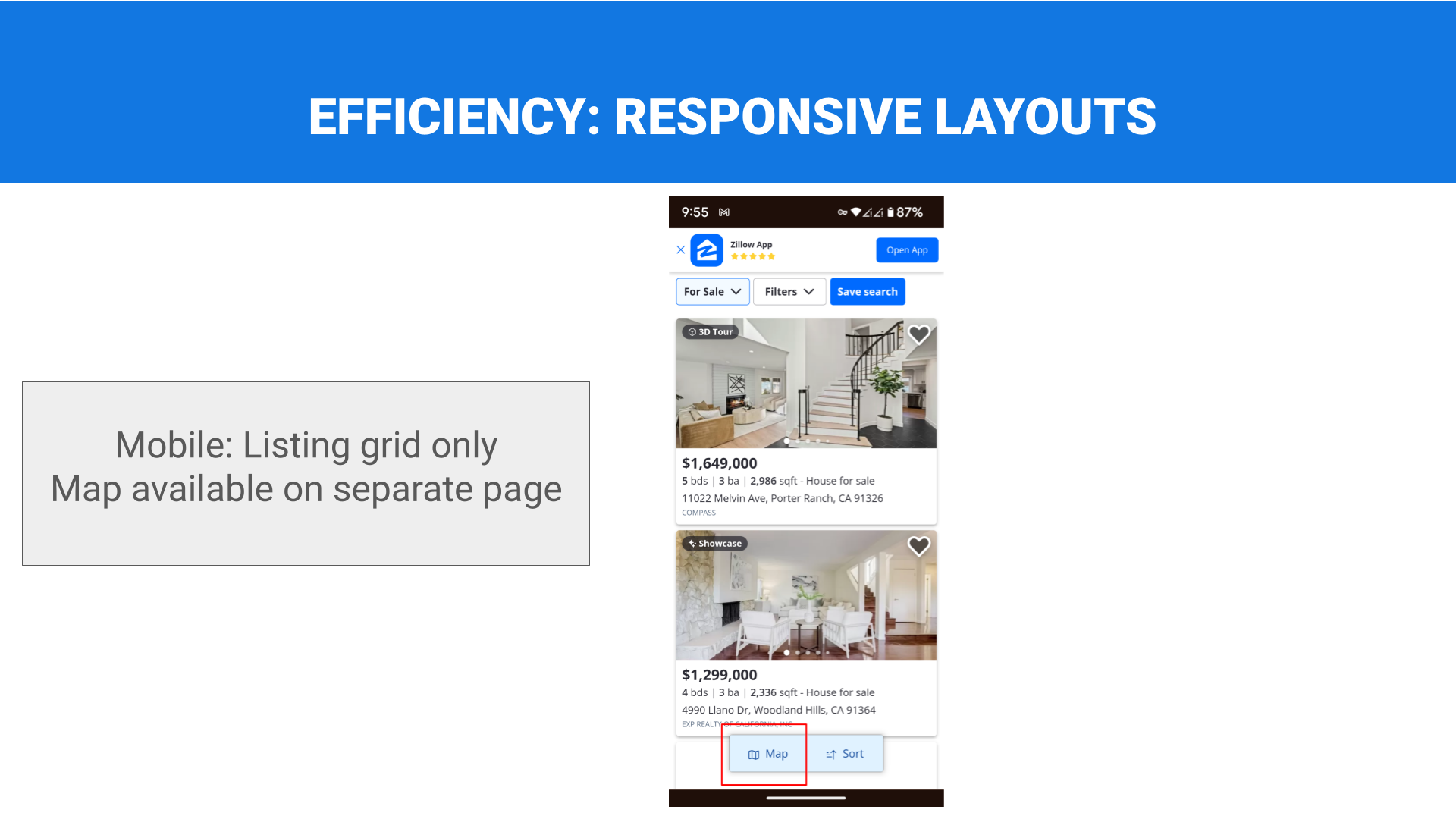
Responsive layouts
Layouts are responsive, and/or optimized for the screen size of target devices.
Relative Prominence
Size and placement of targets, content, and design elements corresponds to their relative importance and frequency of use.
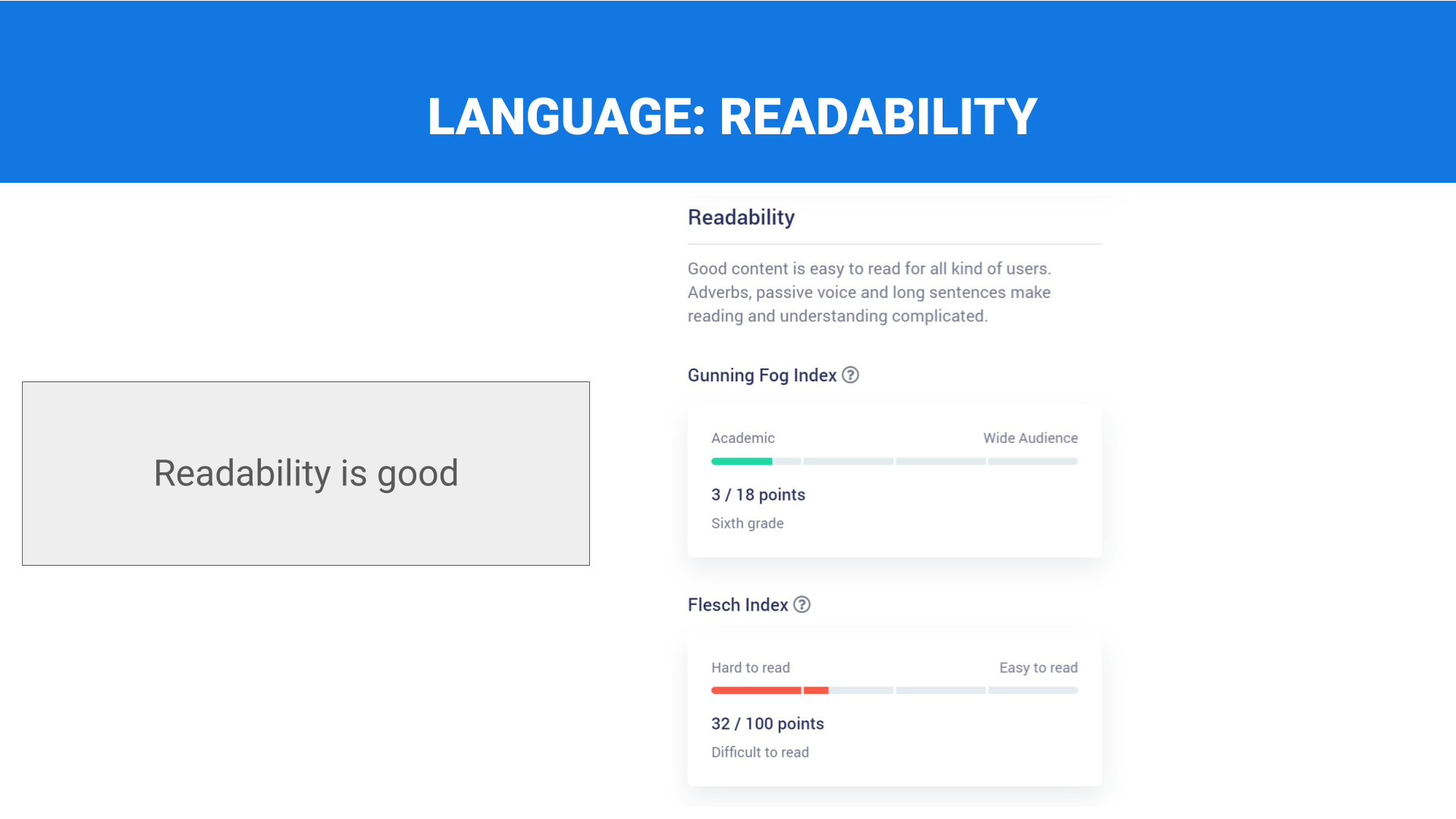
Plain language
Technical, legal, and other potentially difficult-to-understand content for non-expert audiences is written in plain language.
Slide Gallery Order: Left to right going down the column vertically.
















REFERENCES:
CONSISTENCY:
Interaction Design Foundation. (2023, October 13). What are the gestalt principles? – updated 2023. The Interaction Design Foundation. https://www.interaction-design.org/literature/topics/gestalt-principles
Rockport Publishers. (n.d.). Universal principles of design, revised and updated. O’Reilly Online Learning. https://learning.oreilly.com/library/view/universal-principles-of/9781592535873/xhtml/ch22.html
ACCESSIBILITY:
Font size on the web. Accessibility at Penn State. (2020, August 4). https://accessibility.psu.edu/fontsizehtml
Understanding SC 2.5.8:target size (minimum) (level AA). Understanding Success Criterion 2.5.8: Target Size (Minimum) | WAI | W3C. (n.d.). https://www.w3.org/WAI/WCAG22/Understanding/target-size-minimum.html
RECOVERY:
Krause, R. (2019, February 3). “How to Report Errors in Forms: 10 Design Guidelines”. Nielsen Norman Group. https://www.nngroup.com/articles/errors-forms-design-guidelines/
Oneupweb. (2022, December 2). How to design better web forms – best practices. https://www.oneupweb.com/blog/form-design/
MEMORY:
Babich, N. (2023, November 13). Hick’s law: How to make choices easier for users. Webflow. https://webflow.com/blog/hicks-law
Soegaard, M. (2023, November 14). Hick’s law: Making the choice easier for users. The Interaction Design Foundation. https://www.interaction-design.org/literature/article/hick-s-law-making-the-choice-easier-for-users
EFFICIENCY:
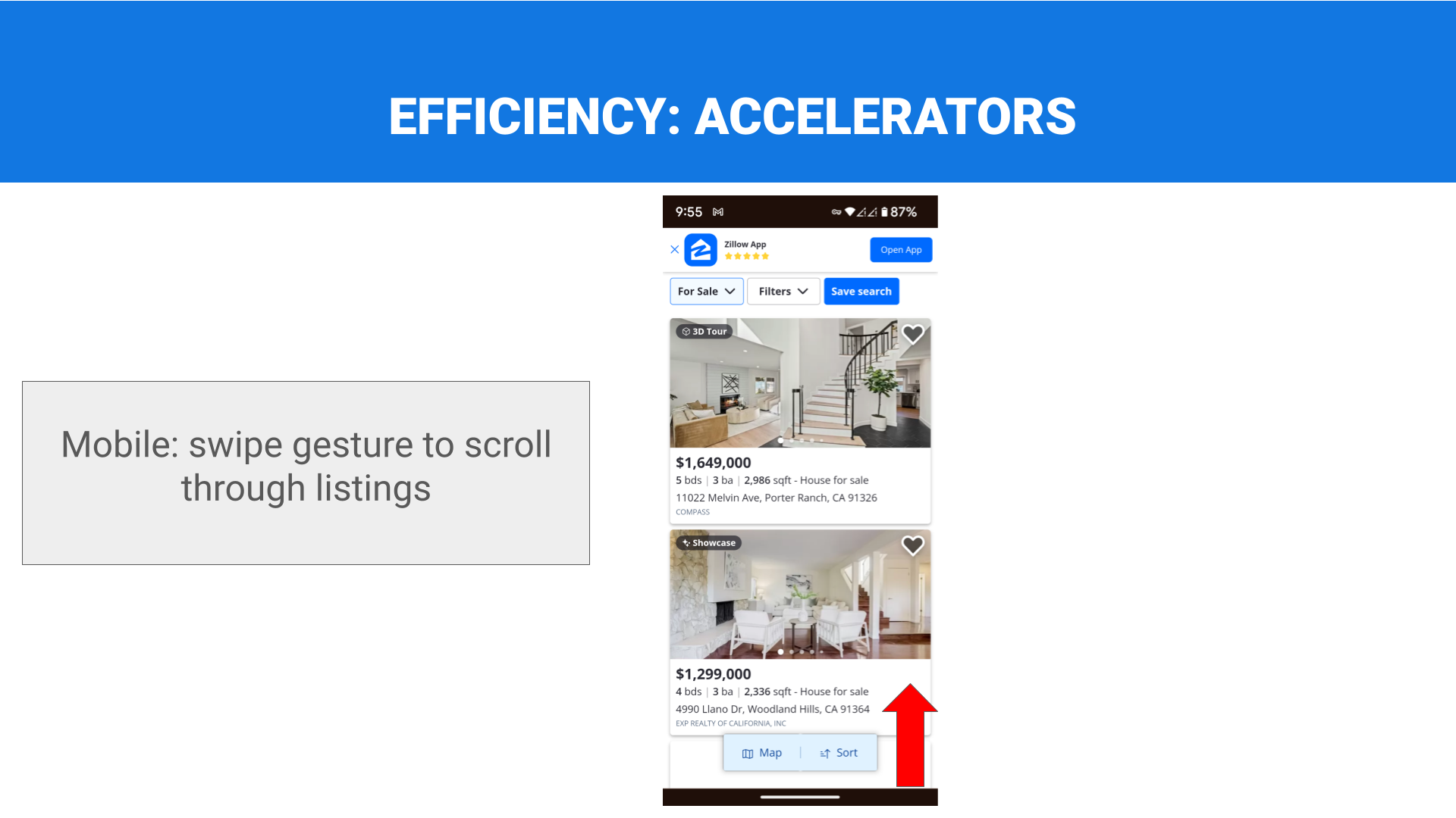
Harley, A. (n.d.). Accelerators allow experts to increase efficiency. Nielsen Norman Group. https://www.nngroup.com/articles/ui-accelerators/
Schwarz, D. (2018, March 6). Responsive design: Best practices and considerations: Toptal®. Toptal Design Blog. https://www.toptal.com/designers/responsive/responsive-design-best-practices
LePage, P. (2019, February 12). Responsive Web Design Basics. web.dev. https://web.dev/articles/responsive-web-design-basics
LANGUAGE:
Katya. (2023, September 13). Readability Test. Copywritely. https://copywritely.com/tools/
Flesch Kincaid Grade Level. Readable. (2021, July 9). https://readable.com/readability/flesch-reading-ease-flesch-kincaid-grade-level/
