
Traffic Light & Pedestrian Signal
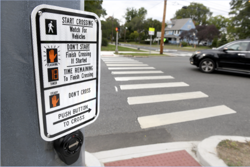
The affordances that stand out to me are its pushability and its visibility. It has only got one primary functionable part, a button that can only be pushed. There is no indication that it should be pulled nor is there any indication that it can’t be turned. Thus leaving the user with one, fairly obvious action, pushing the button. The second affordance is its visibility. It’s large and it’s located directly below the signage. It’s the only button attached to the signage and that affords you that this button belongs to this sign and using it is related to the action described in the signage above it. I think that these affordances do a pretty good job of representing what the pedestrian signal can and can’t do.
The signifiers I see on the traffic light and pedestrian signal are the text of the instructions on how to use it and the icons next to the text that attempt to visually explain the contents of the text instructions. The other signifier I notice is that the arrow on the button is raised up and points in the direction that you should walk. For this particular pedestrian signal, I think that the signifiers that represent the instructions for its use could be improved. While they get the point across about how to use the signal, they are a bit verbose and could probably be shortened to explain the actions required for use more concisely.
The things I see as constraints on the traffic light and pedestrian signal are that the button can only be pushed. You can’t pull it, you can’t turn it, and you can’t toggle it up or down. Another constraint is that if you try to push the button more than once it’s not going to change the outcome of the action. The light isn’t going to change any faster or any slower the more times you push it (even though it is common to think that this will have an effect on how quickly the light changes). A way to make improvements to the constraints may be to add a signifier that says pushing it more than once wont change how long it takes for the light to change.
Fire Doors
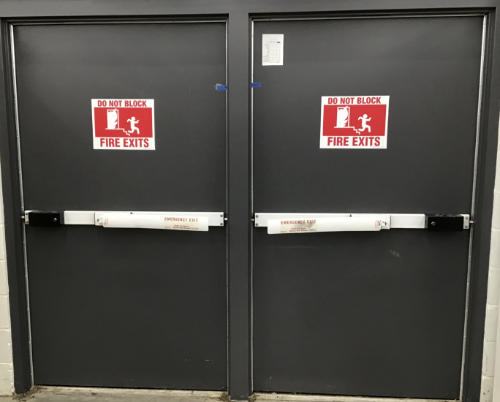
Because they are doors they afford the action of being able to be opened and closed as well as the affordance of passage because you can walk through them to get to whatever is on the other side (and they afford an even larger passage when both are opened at the same time). As far as being a door, they do a pretty good job of affording their primary actions of open and closing. But there may be some constraints that limit their ability when it comes to passage.
The signifiers of these doors express their purpose as an emergency exit. They also signify that you shouldn’t put anything in front of or behind the doors that could hinder their use as an exit in an emergency. And there is a picture on the door that also indicates that there is the possibility of stairs on the other side of the door. On the door the handles are a push bar, on the push bar there are small signifier stickers that also tell you that these doors are an emergency exit and give you instructions on how to open the doors. It also tells you that when you do open the doors an alarm will sound indicating that there may possibly be an emergency alerting others in the vicinity. I think that I would want to paint the doors red to further indicate that their use is for emergency purposes only. And I would want to make the sticker indicating that its an emergency door larger so as to be more visible from a distance.
The main constraint that I see with these doors is the pole in the middle. The pole is going to act as a barrier in the event of an emergency. It’s going to make it more difficult for people with disabilities to exit. It’s also going to make it harder for a large group of people to exit because they will feel like they have to make a decision on which side of the door to exit through which may slow down the evacuation process. I would suggest that the pole be removed and that the two doors close together in the middle or that the two doors be replaced with a single larger door that can accommodate the space required for wheelchairs or large groups of people to exit quickly.
Gas Station Pump
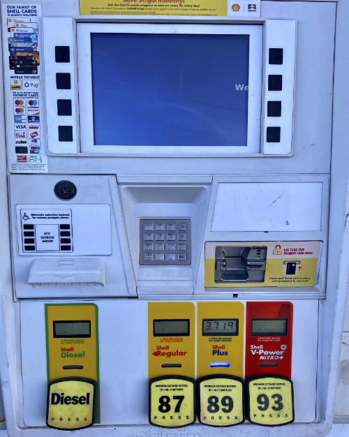
The affordances offered by the gas pump are that it dispenses gas and the interactive keypad and screen provide you with information about its dispensing of gas. Since the gas pump does only one thing, pump gas, I think that it does a pretty good job of affording you what you need to know about that action.
The gas pump has a lot of signifiers that describe a lot of information about the action of dispensing gas and paying for that gas as well as signifiers for other related products (see the advertisement sticker at the top of the pump for the rewards program). You can see a sticker that signifies the types of payments accepted, there’s a label describing how the card reader works, there are labels describing the different types of gas dispensed and there is an area set aside for use by people with disabilities with labels that explain its use as well.
The gas pump has a few physical constraints as well, such as the length of the hose and the location of the display screen. Because of the limited length of the hose that is used to dispense the gas, you have to get your vehicle within a certain distance of the pump. If you’re too far away you won’t be able to refuel your vehicle because the hose wont reach your gas tank. There are also limitations imposed by the location of the display screen, that’s why you have the smaller button panel down below for people with disabilities because they may not be able to reach the buttons on the main screen because of its height.