
ELEVATOR PANEL
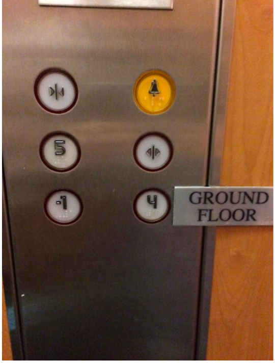
The accessibility concerns surrounding the elevator button panel are numerous. The button layout deviates from the standard, typically, elevator button panels position the “hold open” and “close doors” buttons at the bottom for easy access. However, in this case, these buttons are not only located at the top, but they are also staggered and lack the familiar and easily recognizable icons. This non-standard design can cause confusion, especially for individuals with visual or cognitive impairments, as the icons are small and hard to discern.
Additionally, the placement and appearance of the “alarm” button also diverges from the usual conventions. Typically, this button is situated at the bottom of the panel and is highlighted with a red circle for quick identification. In this instance, the absence of the red circle and the button’s yellow color differ from the expected standard, potentially causing individuals to overlook it in emergency situations.
The numbering of the floors on the panel also raises questions. The ground floor being labeled as “4” instead of “1” can also potentially lead to confusion, as it contrasts with the typical numbering scheme. Additionally, the presence of a floor labeled as “-1” without clear identification of its purpose adds to the ambiguity. In standard practice, basement or parking garage levels are usually denoted by “P” or “B,” making it easier for users to comprehend the layout of the building.
VETERINARY HOSPITAL FLOOR SIGNAGE
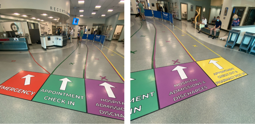
The layout of the reception area in this particular veterinary hospital may, at first glance, appear visually distinct, with the lines and information boxes separated by color-coding, suggesting different functions and different reception areas. The color-coded lines, namely the green appointment check-in, purple hospital admissions and discharges, and yellow appointment check-out and pharmacy pickup lines, may initially give the impression of organized segregation. But, in reality, they lead individuals to what appears to be a shared waiting area, despite their distinctive colors.
This layout could be confusing for visitors, especially those with mobility impairments, as they may need to navigate the converging lines, potentially leading to congestion or misunderstandings about which line to join.
There is at least one positive aspect to the layout: the clear and prominent red box and corresponding red line directing people to a separate emergency check-in counter. This provides an easily discernible path for those requiring immediate attention, enhancing accessibility in emergency situations.
PUBLIC TOILET FLUSHING MECHANISM
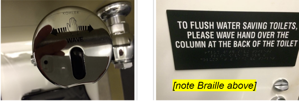
As a parent of a young child, I frequently visit public restrooms and have encountered a wide range of flushing mechanisms, from traditional handles to automatic systems, and even those like the one depicted here, which require a gesture to activate. However, I’ve found that for children, flush mechanisms that rely on a gesture can be particularly challenging to use as they may not be able to get close enough to trigger the flushing action or their hands are too small and don’t trigger the sensor if they can get to it.
In this specific restroom, there are several accessibility issues that need addressing. The instructions for using the gesture-based flushing mechanism are placed on the outside of the stall. This setup is problematic, especially when you are in a hurry to use the restroom, as you may not notice or have time to read the sign. Additionally, the inclusion of Braille on the sign, while well-intentioned, is ineffective because it’s not in a location where people typically look for signage. As a result, blind individuals may not automatically know to reach out and find this information.
And based on the limited information provided by the picture it looks like the sensor itself is quite small and not located in an easily noticeable position. And the small font and dark text color of the directions for use against the shiny chrome material of the sensor make it difficult to read, potentially leading to confusion, particularly for individuals with poor eyesight or visual impairments.