
Here is a little research I did about Gestalt Principles being used in the design of Zillow’s website. Turns out they did take a lot of the principles into consideration and here are some examples:
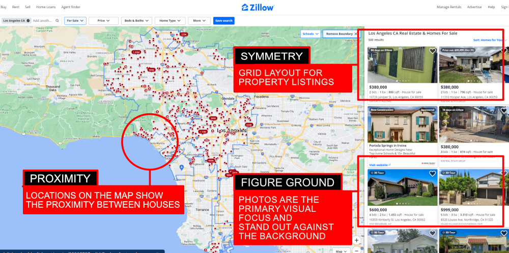
Figure Ground: The listing photos are the primary visual focus of the website. Their size and placement in the sites grid layout allow them to easily stand out against the background and other page elements.
Symmetry: Zillow uses a grid stye layout to present the property listings in an orderly and well defined manner that makes it easy for users to scroll through.
Proximity: On the search results map, individual property listings are shown in relation to other properties near by. Allowing users to see available properties available in given region. This grouping makes it easy to scroll through listings.
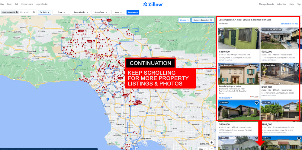
Continuation: Zillows design encourages users to keep scrolling through property listings, photos, and other property related information.
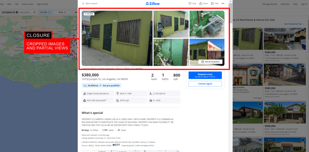
Closure: Zillow displays cropped and/or partially visible photos of homes on certain pages (such as search results). Even though a full image isn’t always visible, users’ minds naturally fill in the missing parts and if a user wants to see the full image its just a click away.
From the use of proximity on the maps to the grid layout of the listings, Zillows website does a good job of promoting a harmonious user experience. Some may say that the grids and maps are boring, but I find it interesting from a design standpoint. I don’t feel like the designers really need to add anything to the design. As is, it works good for what its trying to do; present real estate listings in a way that’s easy to use and not boring (real estate can be a tedious and boring subject sometimes). While in a way it does meet points that could cause something to fall victim to the somnolent effects of Gestalt, I think that the way the designers incorporate continuality in the design offsets a lot of those effects. The ever changing nature of the page keeps it from truly being repetitive or boring.