A sitemap is a way to create a graphical representation of a website that depicts its information hierarchy. They offer a way to visualize the website’s structure and the interconnections between various pages and sections (Babich, N. 2019). Creating a site map during the design process can help you avoid content duplication, clarify the purpose of the website, help in prioritizing essential pages and content and improve user-friendliness by ensuring the content is organized and accessible (Wiredelta, 2022).
There are two main ways to organize a website’s content, Flat (broad) and Deep. A site with a Deep site architecture is going to feature content that contains several layers, each layer is the equivalent of a click away from the home page. A site with a Flat architecture is one where the content is available within a single click away from the home page (SilverDisc Digital Marketing Agency. n.d.).
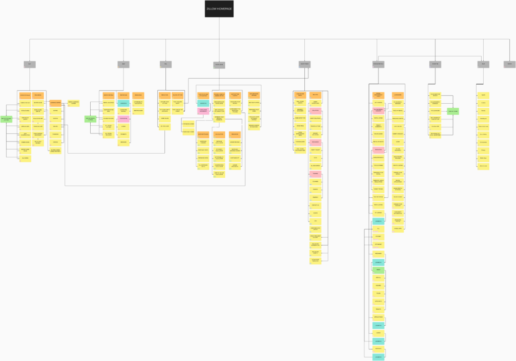
The website Zillow.com, a real estate website for people looking to buy, sell or rent homes or businesses, employs a hybrid flat-deep site architecture, providing easy access to most of its content within a single level from the homepage, but some content requires additional clicks to access. Its primary navigation encompasses eight sections: Buy, Rent, Sell, Home Loans, Agent Finder, Manage Rentals, Advertise, and Help. Each section features a set of related links that are revealed through a mouse-over hover-style menu.
The way the site is organized is designed to be easy for people to quickly navigate to the desired section, be it for finding a new home to buy, or for finding a place to rent for yourself or a place to rent for your business and the majority of the site’s content is available to users who are not logged in, which makes it easy to use. If you were looking to buy a new home you would browse to the “Buy” link and you would see a list of links with a header entitled “Homes for Sale,” under which you would easily be able to find options for homes for sale, foreclosures for sale, homes for sale by owner and homes that are having open houses so you can go see if they are right for you.
I found that the navigation can be a bit confusing. There are a lot of sub-menus in each section. An example of this sub-menu system is the “Buyers Guide” found in the resources section of the buy menu. If you click on the “Buyers Guide” you are taken to a section of the site entitled the “Learning Center.” The Learning Center is a section that has articles about buying, renting, selling, financing, and owning a home. But if you were to click on “Foreclosure Center” from the same resources section, you’re taken to a page that is not included in the sub-menu navigation or as a link from the article section. While that’s a minor issue, it is something that I noticed. There are also a lot of sub-menus in the “Agent Finder” section of the site and the “Home Loans” section has multiple links that take you away from Zillow.com to a separate site called ZillowHomeLoans.com.
The hybrid flat-deep architecture that Zillow uses works well for the complicated subject matter being presented, but there could be some changes to the way the site’s information architecture is designed that would make the navigation a bit less confusing. The first thing I would do is to create a dedicated resources section and move all of the resources links out of their respective categories and into this dedicated section. This would make it much easier to find specific resources. The “Agent Finder” section has a lot of links to things that have nothing to do with finding a real estate agent. The things that aren’t directly related to the topic of finding a real estate agent should be moved to the resources section. It should also be made more clear that many of the home loan resources are not actually on Zillow but are on a separate site. The rental management features could also be moved, they would do better as a separate site since they aren’t directly related to Zillows main content purpose, buying and selling properties. I also think that the advertising link in the main navigation has too high of a priority, as it’s not something that everyone who uses the site is going to be interested in, since it’s specific to what it is, advertising. It’s for people who want to advertise their services. This link is better suited for the footer.
In general, Zillow’s information architecture is solid. While there is room for improvement, the site effectively organizes its core information about buying and selling property in a straightforward and user-friendly manner.
References
Lewis, B., Kingston, C., Babich, N., & Norder, K. (2019, December 17). Sitemaps & Information Architecture (IA): Adobe XD Ideas. Ideas. https://xd.adobe.com/ideas/process/information-architecture/sitemap-and-information-architecture/
What is deep site architecture in Seo?. SilverDisc Digital Marketing Agency. (n.d.). https://www.silverdisc.co.uk/blog/2022/02/23/what-deep-site-architecture-seo
Wiredelta. (2022, May 31). 5 reasons to build a visual sitemap before designing a website. https://wiredelta.com/5-reasons-to-build-a-visual-sitemap/