
Airport Bathroom
A bathroom typically serves as a private space for individual personal hygiene and sanitation, it provides all of the necessary and essential environment elements for bodily functions and self-care.
Strengths
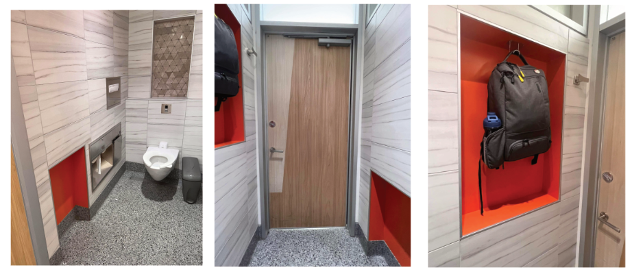
Looking at the picture of the airport bathroom above, it appears to represent the typical mental model of what we all expect a bathroom to look like. The decor in the bathroom is modern and beautiful and would make for a pleasant self-care experience.
Weaknesses
The weaknesses of this particular bathroom are its accessibility issues. We don’t know exactly where this bathroom is, but if it were located in California, it wouldn’t meet all the requirements set out by the American Disabilities Act (ADA) for accessibility (Radojcic, A., 2023, February 9).
At first glance, it might seem like this bathroom is too small for a person in a wheelchair to use comfortably. But if you look closely, you’ll see a small cutout in the wall. This cutout has been included as an attempt to try and follow the ADA rules, which say there should be a large enough space for a wheelchair to turn around. According to the ADA, there needs to be a sixty inch radius circle within the bathroom stall to allow for a wheelchair to turn around. While we can’t be exactly sure without measuring that this cutout meets that requirement, it probably comes close.
There are also some other ADA requirements that are missing from this bathroom. First, there are no grab bars to help someone with a disability hold onto while using the toilet. These bars are important for safety and accessibility for those with a disability that may prevent them from being able to easily get up from a sitting position. Also, the dispenser that holds seat covers looks like it might be too high for some people to reach (U.S. Access Board. Chapter 6: Toilet Rooms., n.d.). But again, it’s tough to say for sure without measuring it in person.
Another problem is that the hooks on the wall that afford a user of the bathroom a place to hang their bags or coats, are too high. ADA rules say that at least one of them should be lower so that everyone can use it. But in this picture, I don’t see a lower hook.
Parking Lot Payment Machine
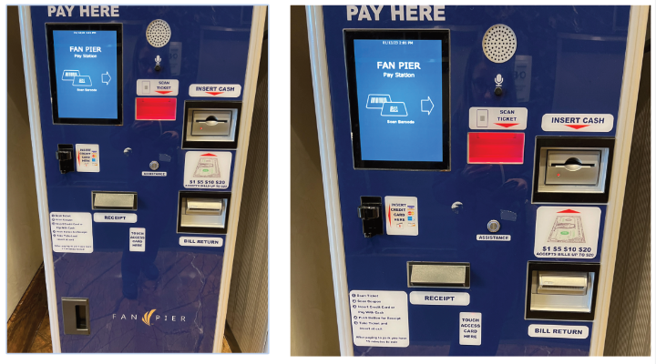
Parking Pay Stations are designed to collect revenue from people parking. Often automated, parking lot payment stations offer users the convenience of paying with various methods, including credit and debit cards or cash.
Strengths
The primary strengths of automated parking pay stations is that they significantly reduce the time it takes to pay for parking. They can operate 24 hours a day, 7 days a week since they don’t require a human attendant and often accept various payment methods.
Weaknesses
The design of parking lot pay stations is full of weaknesses. As H. Locke points out in his excellent article on the bad design of parking ticket machines (Locke, H., 2021, December 23), there are a variety of things that are wrong with the typical pay station design. These machines often lack a clear task flow, and the absence of feedback when an error occurs can add to the usability challenges associated with them. While this particular machine does provide some basic instructions on its use, it is by no means comprehensive and its location at the very bottom of the machine isn’t easy to find at first glance.
And while we often use our memory of past experiences to inform our present situation, the design of parking pay stations varies so much that trying to compare how you used a similar machine last time isn’t necessarily going to inform you on how to use the machine you’re currently using. This is due to the lack of consistency in these machines’ design.
Another problem with the design of these machines is the cognitive load that is placed on you when you’re trying to pay. As Scott Riley points out in chapter one of his book on mindful design, while not specifically talking about paying for parking, he makes an applicable point that there is “..a potentially huge amount of attentional switching and decision-making for something so seemingly trivial.. (Riley, S., n.d.).” Paying for parking should not cause you to experience mental fatigue.
Redesign Suggestions
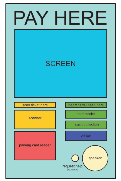
The design of a parking payment machine needs to be drastically simplified. It only needs to have the essential elements and clear and concise instructions on its use. I would design the machine to have large text telling you exactly what it is, the place to pay for parking. It should have a large screen front and center and the screen should display simple and clear instructions for its use. The screen is going to have all the functions necessary to park, if you have to enter your parking space or license plate, it’s all done via the screen with easy to use touch buttons. The ticket scanner and parking access card readers are going to be large and obviously labeled with clear signifiers that this is their function. The cash insert is going to serve as both payment and change dispenser and the card reader is going to be next to the cash insert so all forms of payment are next to each other to make it obvious where and how to pay.
References
Radojcic, A. (2023, February 9). Ada restroom requirements: Stalls, toilets & more: Maintco. Maintco Corp. Retrieved from: https://maintco.com/news-media/california-ada-bathroom-requirements/ on 10/20/23
U.S. Access Board. Chapter 6: Toilet Rooms. (n.d.). Retrieved from: https://www.access-board.gov/ada/guides/chapter-6-toilet-rooms/ on 10/20/23
Locke, H. (2021, December 23). Why are car park ticket machines so badly designed?. Medium. Retrieved from: https://medium.com/@h_locke/why-are-car-park-ticket-machines-so-badly-designed-1c2710587940 on 10/20/23
Riley, S. (n.d.). Mindful design: How and why to make design decisions for the good of those using your product. O’Reilly Online Learning. Retrieved from: https://learning.oreilly.com/library/view/mindful-design-how/9781484242346/html/464673_1_En_1_Chapter.xhtml on 10/20/23