Audience:
1) Novice cruisers seeking information. The first group are people who have never been on a cruise before but want
to go on one.
2) Loyal Carnival customers looking for new experiences. The second group are people who have been on a Carnival cruise before
and want to go on another one.
3) Cruisers from other lines curious about Carnival. The third group are people who have been on cruises on other cruise lines
but have never been on a Carnival cruise.
Mission:
Educate and inform about unique cruising experiences with Carnival,
including detailed itineraries and destination insights.
If you’ve never been on a cruise and you want to go on one the site can inform and educate you on what the cruise experience is like. If you’ve been on a Carnival cruise before and you want to go on another cruise, the site can offer you information about itineraries, embarkation ports and destinations that you may not have been to before and tell what those places are like and what you might expect if you chose to go to those places. And if you’ve been on cruises before with other cruise lines, the site can educate and inform you on the differences between Carnival and those other brands and help you to understand why you should choose to go on a Carnival cruise.
Vision:
Empower and inspire potential cruisers by highlighting the diverse and
exciting offerings of Carnival Cruise Lines.
The vision of Travel Day Adventures is to empower, educate, and inspire the site’s audience by offering valuable insights into the cruise experience. Highlight the wide variety of available itineraries, and onboard activities available with the goal of getting potential cruisers to choose Carnival over other brands for their next trip.
Architecture
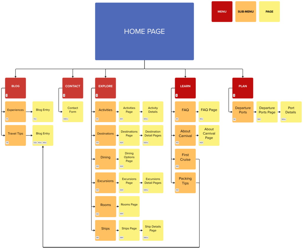
Navigation Menu:
- About: About Travel Day Adventures. The vision, mission, and objectives of the
site. - Blog: General information articles from the site’s authors. Topics include things
such as personal experiences, travel tips and advice. - Contact: A contact form to gather information about potential clients’ needs.
- Explore: Information about cruising including topics like onboard activities,
destinations, onboard dining, on-shore excursions, types of rooms available
and general information about the different cruise ships. - Learn: Information about the Carnival brand, what to expect on your first cruise,
frequently asked questions and packing tips. - Plan: Plan your trip by learning about departure ports.
Wireframes for Desktop and Mobile
The desktop and mobile design for the home page, navigation menus, search
results and a sample of a content page.

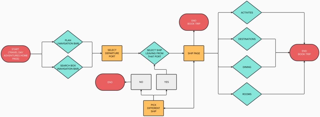
User Flow: Pick a Departure Port

Content Management
The site’s content will be managed by using WordPress and taking advantage of
its built in search and metadata capabilities. WordPress helps you manage your
content by using categories and tags. Categories are used for broad grouping of
post topics and are hierarchical, meaning you can have subcategories. Every post
created in WordPress must be filed under at least one category. Categories help in
structuring your site by grouping your content into different sections. Tags are
used to describe specific details of your content. Unlike categories, tags are not
hierarchical. They are used to highlight specific keywords relevant to a post. Tags
are more specific than categories and are used as keywords for a post to help
with searching for content within.
References
Birch, D. (2020, July 14). A UX Designer’s Guide to User Flows. Medium.
https://uxdesign.cc/a-ux-designers-guide-to-user-flows-bbbc61f8b666
Blog tool, publishing platform, and CMS. WordPress.org. (n.d.).
https://wordpress.org/
Boicheva, S. (2023, June 19). 45 examples of Great Mobile Menu Design and
6 best practices. htmlBurger Blog.
https://htmlburger.com/blog/mobile-menu-design/
Browne, C. (2022, December 6). How to create a user flow [2023
step-by-step guide]. CareerFoundry.
https://careerfoundry.com/en/blog/ux-design/how-to-create-a-user-flow/
Carnival Cruise Line. (n.d.). Cruises: Carnival cruise deals: Caribbean, the
Bahamas, Alaska, and Mexico. https://www.carnival.com/
How to manage your site’s Page Hierarchy. USC Viterbiit. (2023, August 1).
https://viterbiit.usc.edu/services/digital-communication-services/wordpress/viterbi-wordpress-platform/how-to-manage-your-sites-page-hierarchy/
Laubheimer, P. (n.d.). Tree testing: Fast, iterative evaluation of menu labels
and categories. Nielsen Norman Group.
https://www.nngroup.com/articles/tree-testing/
Rosenfeld, L., Morville, P., & Arango, J. (n.d.). Information Architecture, 4th
edition, Chapter 10, O’Reilly Online Learning.
https://learning.oreilly.com/library/view/information-architecture-4th/9781491913529/ch10.html
The Pros and cons of Wireframing a web design. (n.d.).
https://www.webdesign-inspiration.com/blog/the-pros-and-cons-of-wireframing-a-web-design
Schade, A. (n.d.). Write better qualitative usability tasks. Nielsen Norman
Group. https://www.nngroup.com/articles/better-usability-tasks/
Spivak, E. (2023, October 5). How to improve your website’s cross-browser
compatibility. Blog.
https://www.wix.com/studio/blog/crossbrowser-compatibility
