Planning a Flight User Scenario
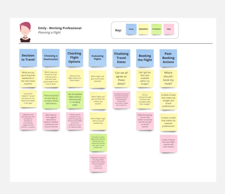


A look the entire flow for a possible travel app that include booking a flight, finding a hotel and finding activities at the destination.
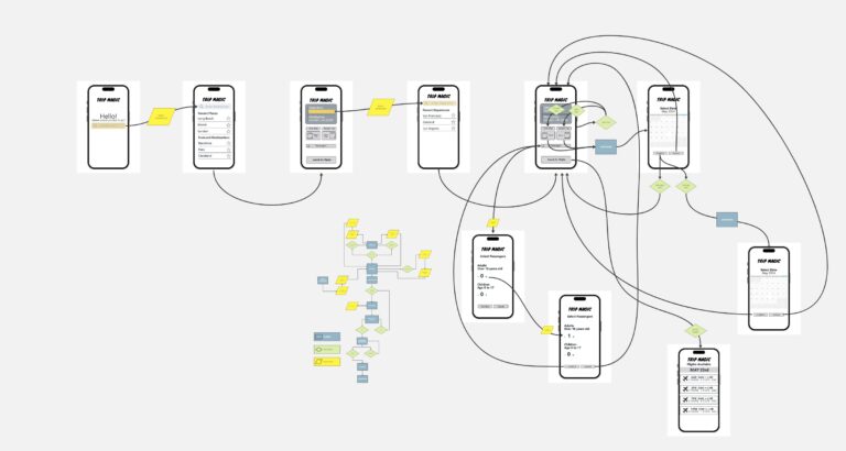
A look at wireflows for a travel app, specifically the flows for booking a flight.

Audience: 1) Novice cruisers seeking information. The first group are people who have never been on a cruise before but wantto go on one. 2) Loyal Carnival customers looking for new experiences. The second group are people who have been…

Abstract This research explores the role of memes in building and sustaining online communities, focusing on how memes serve as tools for communication, bonding, and cultural expression. By integrating user-centered design methodologies such as surveys, interviews, empathy maps, and user…
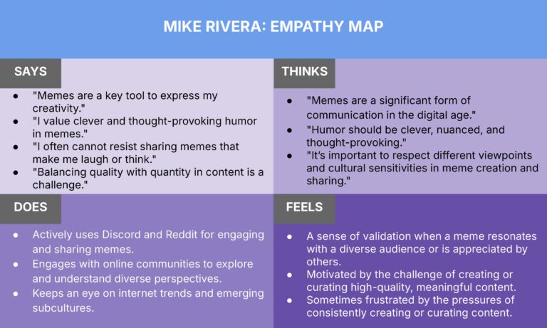
An empathy map for the meme creator for the meme community project. Two different versions of the same data.
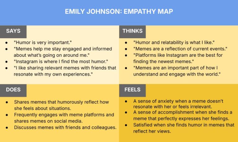
An empathy map for the meme consumer for the meme community project. Two different versions of the same data.
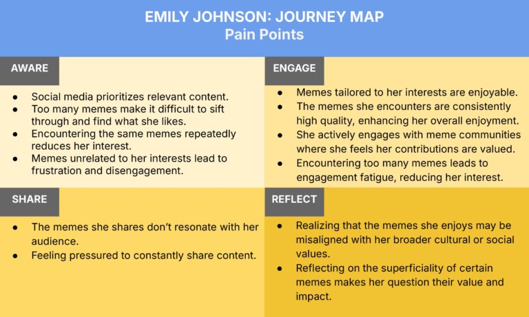
An journey map for the meme consumer for the meme community project. Two different versions of the same data.
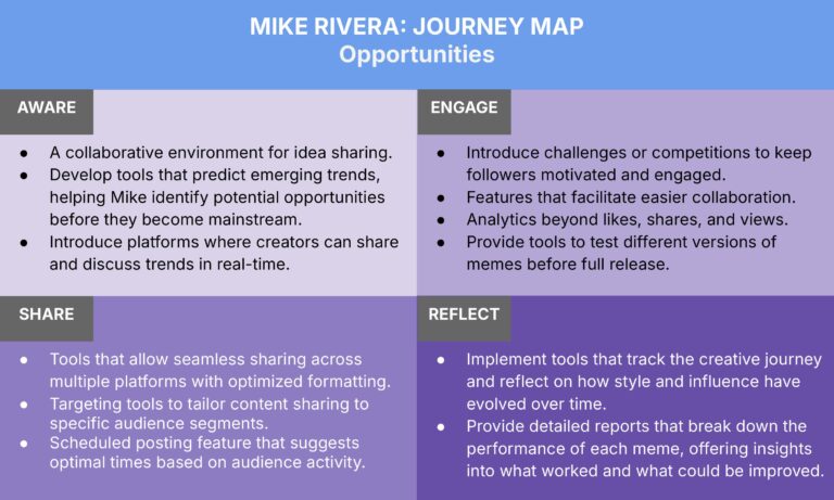
An journey map for the meme creator for the meme community project. Two different versions of the same data.
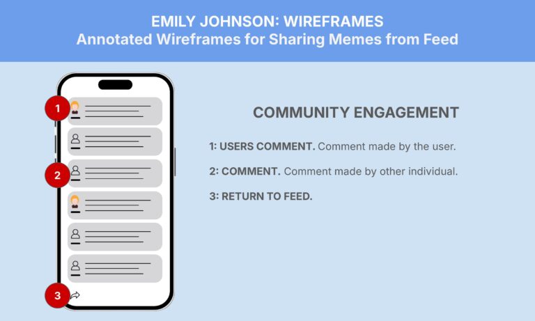
Annotated wireframes for the meme consumer persona in the meme sharing community.
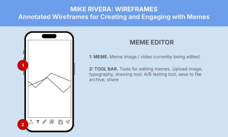
Annotated wireframes for the meme creator persona in the meme sharing community.
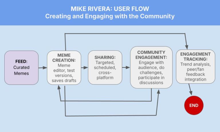
A look a the way an online community based around meme creators and meme consumers could work, with a focus on the sharing mechanics.